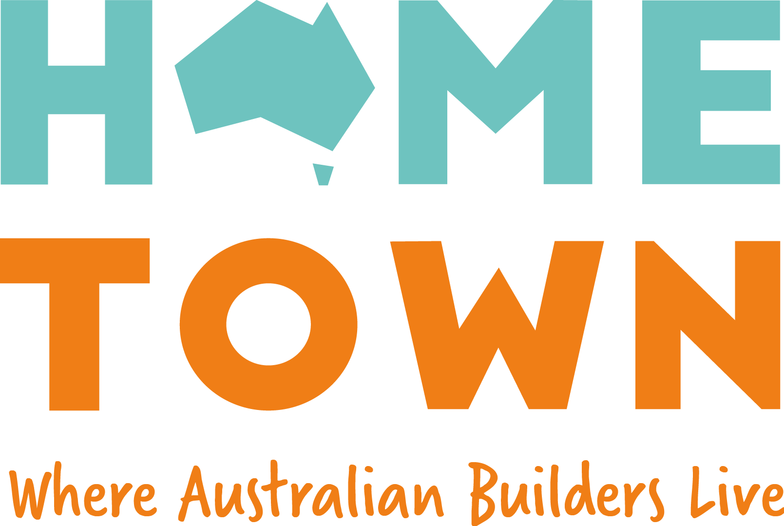
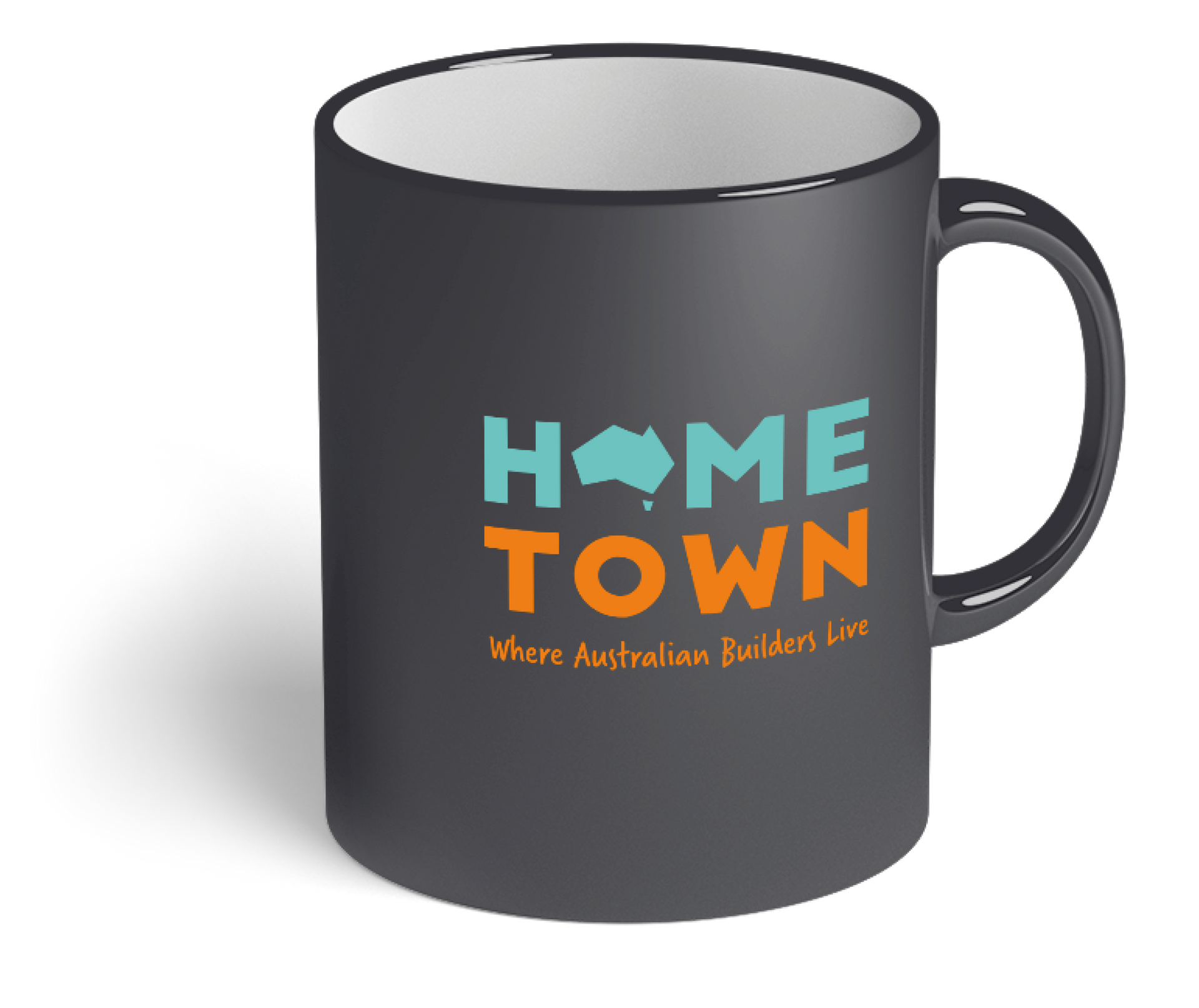
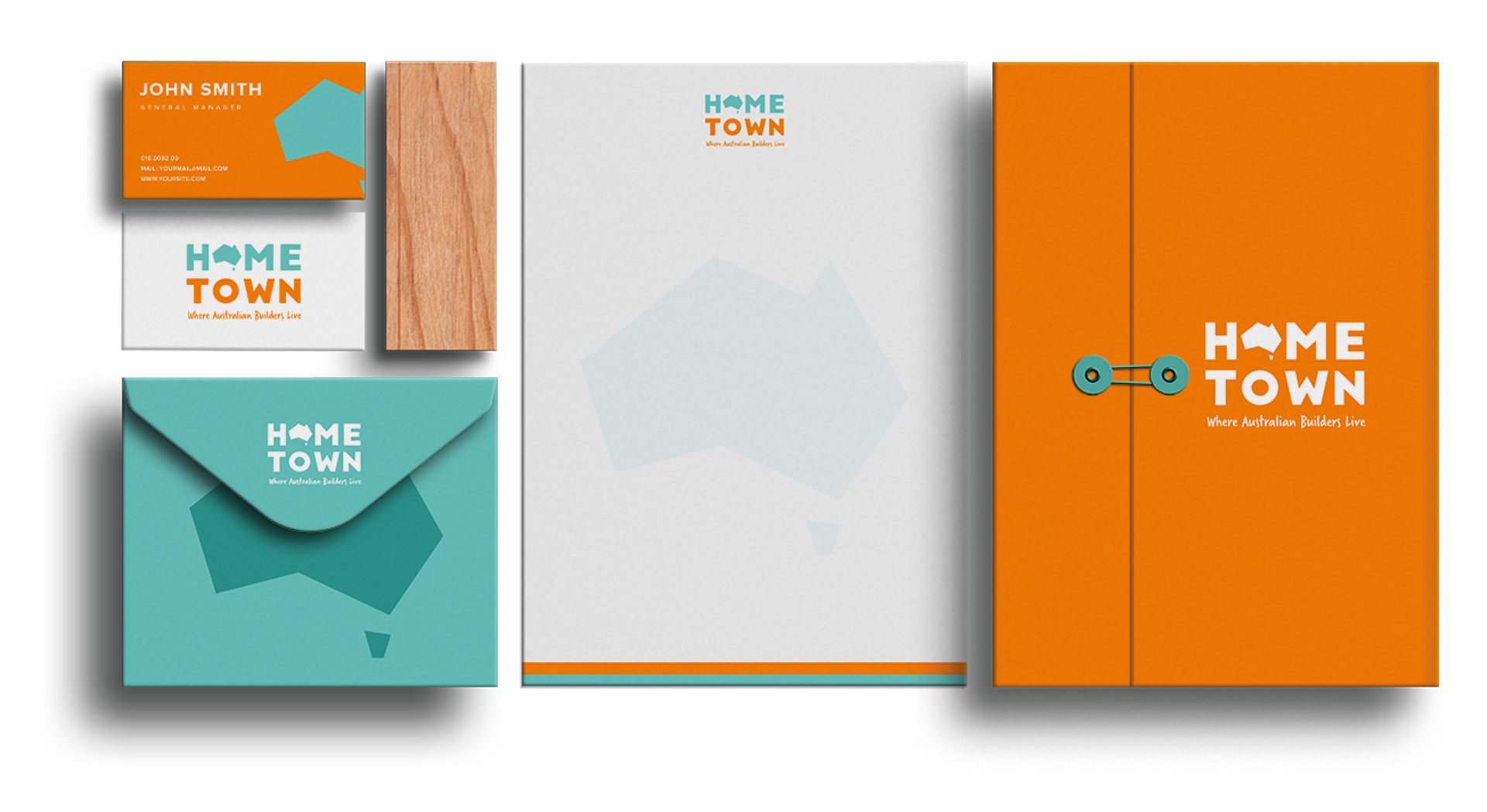
Developing Home Town's logo and brand was an exciting journey that extended to font and colour selection. We carefully crafted a logo that captured the brand's essence, drawing inspiration from the Australian construction company. This holistic approach ensures that the brand, with its font choices and colour movement, truly represents its unique identity, setting the stage for a strong, enduring presence.